For my poster analysis and comparison, I have decided to doStar-wars Episode II: Attack of the Clones. The second instalment in the star-wars prequel trilogy after The Phantom Menace but the fifth in the overall film series. The film is directed by George Lucas and written by George Lucas and Jonathan Hales. The returning cast of the previous film include Ewan McGregor, Natalie Portman, Ian McDiarmid, Samuel L Jackson as well as new actors such as Hayden Christensen, Christopher Lee and Temuera Morrison.
The story is chronologically set 10 years after the Phantom Menace and 22 years before Rogue one and A new hope. The purpose of the story’s narrative is show how the galactic republic fell into war and would end up as how the Empire would get its Stormtroopers.
Content:
In the theatrical poster, it shows a couple of the main characters in the movie such as Anakin(Christensen), Obi-wan(McGregor) and Padme(Portman)who’s images are large and in the background whilst some characters such as Jango(Morrison), Mace(Jackson) and Yoda(Oz) are in the mid and foreground but are smaller and less easy to spot. This shows is that they will have a minor or major role to the overall story.
Near the mid centre, you can see an explosion which could mean that some conflict will happen in the story, which according to the main story is the beginning battle of the clone wars however due to where it is placed on the poster, it isn’t going to be a long set of scenes.
Near the main title, you can barely see R2-D2 and C3-PO who are in all of the star-wars films and are majorly known as major sci-fi and pop culture icons.
Written language:
The amount ofwritten language seen in the poster differs due to the different titles seen. The first piece of writing seen is the star-wars logowhich is small and on top of the main title. The ‘Episode II’ part is the biggest in terms of text size as it is the main headline portion of the film’s title. The font is big to make the movie viewers look that Episode II is the eye catcher.The ‘Attack of The Clones’ bit is placed on the bottom centre as it’s the film’s secondary title.
Though it is a bit hard to see. You can see the credits that are usually seen in a movie poster which is on the bottom and tells us the main actors, the producers, the writers,the directors and the distributing company. Also on the bottom will be the age classification for the film set by the British Board Film Classification (BBFC).
Typography:
The posterlanguage has been chosen so effectively that the title “Star Wars Episode II” will be the main thing that will catch the reader’s attention since the production company, Lucasfilms tries to make each of the movies to look like an episode. The colours of the text help to represent the movie e.g. bronze could mean that it’s a classic or that it helps set the scene.
Photographs and Illustrations:
In the poster, you can see the characters who will show up in the movie throughout. The main characters are in the back whilst the reccuring characters are in the front.
Representations:
In the movie, the main female lead, Padme is a senator, a leadership role which shows us that women are treated as equals and not as objects. The main character Anakin, is shown to be strong-willed, loyal and respectful but can be impulsive and reckless. His mentor, Obi wan shows straits of a typical mentor: calm, looking over his trainee’s shoulder as well as either complimenting or complaining depending on the situation.
Colours schemes:
In the poster, the main colours seen are black as well as different shades of brown and tan like colours. The main contrasts to make the poster stand out and not for it to be dull is the light blue from Obi wan’s light-saber as well as the silver and navy blue combination for Jango Fett’s Armour.
Comparing 20th and 21st century posters:
My comparison of posters is going to between a new hope (the first/original star wars Film) and Attack of the clones.
|


From what you can see by looking at the poster,there are many similarities and differences between the posters.
Images:
In the 20th century poster uses illustrations of the characters. The drawing of Darth Vader is shown to be ominous and scary, showing that he is going to be the antagonist. Luke’s character isshown to be muscular, powerful, heroic and the fact that his shirt ripped.This is saying that he is the main character.
The 21st century poster doesn’t show, who the main antagonist in the film is but the protagonists are shown. It also doesn’t show which of these are going to be either the hero or the villains of the story, simply by their look on the poster.
Credits:
Another difference is how the poster is set up. In the 20th century poster, you can see that on the bottom, you can see the credits are easier to read and look at thanks to the white background and the black text. The illustrations are also for the most part, dominate the screen. In the 21st century poster, the images dominate the entire frame. The credits section is somewhat visible as it is using the same colour as the main title.
Slogans:
Whilst not seen in the 21st century poster, the original 20th century has a slogan which is very essential to the movie itself since it is a sci-fi film. The fact that a slogan was used in the poster was generally the norm during the 1960s and 1970s because unlike the present, with the latest filming equipment and special effects seen in trailers, slogans on posters were an effective way in getting the film marketed and advertised to the general market.
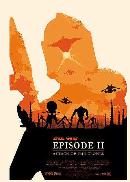
Alternate posters:
Alternate posters are not technically official and are essentially fan made posters that have been created by fans to show their take on a specific movie poster. These posters also give more information on the narrative by adding in something important that the official poster didn’t add. Here’s an example:
Conclusion:
To conclude, I very much believe that both the specific and general codes and conventions that apply to movie posters and overall posters have greatly changed in the decades. A major thing that helps with this is society. Up until the 1990’s, society was mainly controlled by men.
This also affected the cinema and made women look like objects and not really people. An example of this is in the James bond films, the protagonist would be surrounded by gorgeous women who are in supporting roles.
Now society has changed so that women are treated more like equals instead of objects. A recent example is this year’s DC Comics Wonder Woman, in which Gal Gadot was the main character and Chris Pine was in the supporting role.
